Application Overview
Introduction
The Application Overview page in Devtron gives you a complete view of your Devtron Applications. It includes information about your projects, applications, environments, and pipelines, all in a single view.
It helps you understand how your applications are organized, how your workflows are performing, thus, giving you better visibility and control in a single pane of view.
The Application Overview page contains the following sections:
- At a Glance
- Workflow Overview
- Triggers & Build Time
- Most & Least Triggered Pipelines
- Cost Visibility
- Best Practices
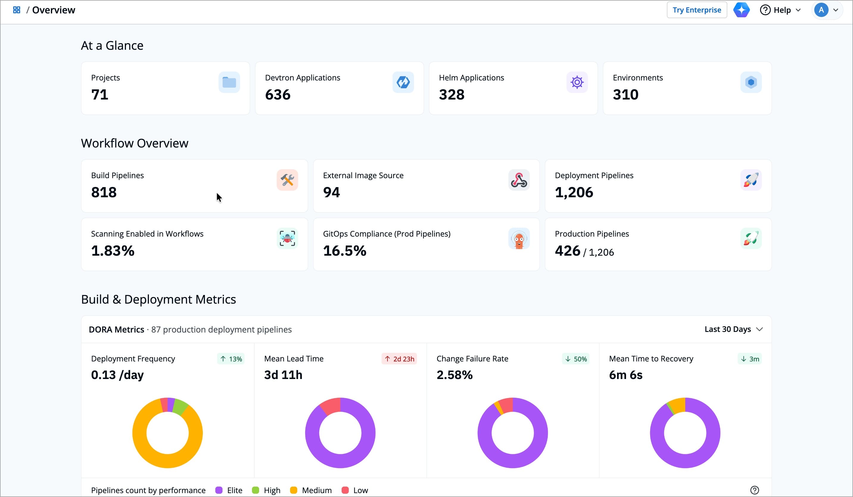
At a Glance
The At a Glance section displays the total count of Projects, Devtron Applications, Helm Applications, and Environments, giving you an instant view of your overall applications in Devtron.
| Card | Description |
|---|---|
| Projects | Total number of projects in Devtron |
| Devtron Applications | Total number of Devtron applications across all the clusters |
| Helm Applications | Total number of Helm applications across all the clusters |
| Environments | Total number of Environments in Devtron across all the clusters |
Workflow Overview
The Workflow Overview section displays how your CI/CD workflows are functioning in Devtron. It displays important metrics such as the number of build and deployment pipelines, external image sources, and production pipelines. It also shows how many pipelines follow GitOps best practices and have image scanning enabled.
| Card | Description |
|---|---|
| Build Pipelines | Shows the total number of build pipelines configured in your Devtron |
| Deployment Pipelines | Shows the total number of deployment pipelines across all applications |
| External Image Sources | Shows the total number of build pipelines which uses external image source |
| Scanning Enabled in Workflows | Shows the percentage of workflows that have scanning enabled for images |
| GitOps Compliance (Prod Pipelines) | Shows how many production pipelines are configured using GitOps for configuration consistency |
| Production Pipelines | Shows the total number of production pipelines defined within your Devtron |
Build & Deployment Metrics
The Build & Deployment Metrics section helps you assess how efficiently your teams deliver software using Devtron pipelines. It uses the industry standard DORA metrics to measure delivery performance and reliability across production deployment pipelines.
You can track four key metrics over a selected time range (for example, the last 30 days).
| Metric | Description |
|---|---|
| Deployment Frequency | Shows how often your deployment pipelines push new releases to production |
| Mean Lead Time | Shows the average time it takes for a code change to move from commit to production. It helps you understand how quickly your team can deliver new features or fixes |
| Change Failure Rate | Indicates the percentage of deployments that result in a failure or rollback. It helps you measure release stability and identify where improvements can reduce disruptions |
| Mean Time to Recovery (MTTR) | Measures how long it takes to recover from a failed deployment. It helps you assess how effectively your team can respond to and fix issues when they occur |
| Pipelines Count by Performance | Categorizes pipelines into Elite, High, Medium, and Low performance based on DORA metrics. Helps identify which pipelines are performing well and which may need improvement |
Each DORA metric in Devtron uses color-coded categories to represent pipeline performance levels. These colors help you quickly interpret how your production deployment pipelines are performing, from Elite (best-performing) to Low (needs attention).
The meaning for each color vary slightly across different metrics, reflecting how delivery speed, stability, and recovery time are measured in real-world DevOps performance. The table below summarizes what each color means for every DORA metric in Devtron.
| Metric | Color | Category | Description | Range / Criteria |
|---|---|---|---|---|
| Deployment Frequency | 🟪 Elite | Top performing pipelines | Deployed more than once per day | > 1 per day |
| 🟩 High | High-performing pipelines | Deployed between once per day and once per week | 1 per day – 1 per week | |
| 🟨 Medium | Moderately active pipelines | Deployed between once per week and once per month | 1 per week – 1 per month | |
| 🟥 Low | Infrequently deployed pipelines | Deployed between once per month and once per 6 months | 1 per month – 1 per 6 months | |
| Mean Lead Time | 🟪 Elite | Top performing pipelines | Mean lead time is less than 1 day | < 1 day |
| 🟩 High | High-performing pipelines | Mean lead time is between 1 day and 1 week | 1 day - 1 week | |
| 🟨 Medium | Moderately efficient pipelines | Mean lead time is between 1 week and 1 month | 1 week - 1 month | |
| 🟥 Low | Slow pipelines | Mean lead time is between 1 day and 6 months | 1 day - 6 months | |
| Change Failure Rate | 🟪 Elite | Top performing pipelines | Change failure rate is between 0-15% | 0-15% |
| 🟩 High | High-performing pipelines | Change failure rate is between 16-30% | 16-30% | |
| 🟨 Medium | Moderately stable pipelines | Change failure rate is between 31–45% | 31–45% | |
| 🟥 Low | Unstable pipelines | Change failure rate is between 46–60% | 46–60% | |
| Mean Time to Recovery (MTTR) | 🟪 Elite | Top performing pipelines | Mean time to recovery is less than 1 hour | < 1 hour |
| 🟩 High | High-performing pipelines | Mean time to recovery is between 1 hour and 1 day | 1 hour – 1 day | |
| 🟨 Medium | Moderately resilient pipelines | Mean time to recovery is between 1 day and 1 week | 1 day – 1 week | |
| 🟥 Low | Slow recovery pipelines | Mean time to recovery is more than 1 week | > 1 week |
Suppose your DevOps team is reviewing delivery performance for the last month. You notice that while Deployment Frequency has increased, the Mean Lead Time has also gone up. This suggests that more deployments are happening, but each one is taking longer to reach production. By comparing the Change Failure Rate and Mean Time to Recovery, your team can identify whether the delay is due to testing, approvals, or rollback handling. With these insights, you can fine-tune your workflow or automation to achieve faster and more reliable releases.
Triggers & Build Time
The Triggers & Build Time section provides a detailed view of your build and deployment activities in Devtron. It helps you understand how frequently builds and deployments are triggered, how long they take, and how successful they are over time.
At the top, you will see three key indicators:
| Field | Description |
|---|---|
| Total Build Triggers | The total number of builds triggered across all pipelines within the selected time period. |
| Average Build Time | The average time taken for a build to complete successfully. |
| Total Deployment Triggers | The total number of deployments triggered during the selected time period. |
Below each indicator, you will also find a corresponding graph that visualizes its trend over selected period of time. You can adjust the Time Range in the top-right corner of the graph to analyze workflow trends over different periods.
| Option | Description |
|---|---|
| Today | Shows build and deployment activity for the current day |
| This Week | Displays data from the current week (Monday-Sunday) |
| Last Week | Displays data from the previous week for comparison |
| This Month | Aggregates data for the ongoing month |
| Last Month | Shows activity from the previous month to help you analyze changes month-over-month |
| This Quarter | Groups workflow data by the current quarter (April-June, July-September, October-December, or Jan-March) |
Build Triggers Graph
This graph displays how build triggers change over time.
- Blue line - Total build triggers
- Green line - Successful builds
- Red line - Failed builds
Hover over any point on the graph to view daily build statistics, including total, successful, and failed builds. This helps you identify trends in build frequency and stability.
Deployment Triggers Graph
This graph tracks how often deployments are triggered and how many of them succeed or fail.
- Blue line - Total deployments triggered
- Green line - Successful deployments
- Red line - Failed deployments
Hover over a specific date to see deployment counts and outcomes, helping you understand deployment frequency and reliability trends.
Average Build Time Graph
This graph shows how the average build duration varies during the selected time range.
- The blue line represents the average build time per day (in minutes).
- The dotted line shows the overall average for the selected period.
It helps you identify days when build duration increased significantly, signaling potential issues like resource bottlenecks or slower build steps.
Suppose your team wants to analyze why release cycles slowed down this month.
You open the Triggers & Build Time section and notice that build triggers spiked on October 10, with several failed builds. Deployment triggers show a similar peak on October 8, where 73 deployments ran, and 18 failed. Meanwhile, the Average Build Time graph shows a sudden rise on October 3, where builds took three times longer than usual.
With these insights, your team can connect the dots between build failures, longer build durations, and delayed deployments, helping you take timely corrective action to keep releases smooth and predictable.
Most & Least Triggered Pipelines
This section shows the build and deployment pipelines that were triggered the most and the least within the selected time range. It helps you identify which pipelines are most active and where fewer executions might indicate inactive or underused workflows.
The section provides two tabs, Build Pipelines and Deployment Pipelines, each displaying a bar chart that ranks pipelines based on how frequently they were triggered during the selected time range.
| Tab | Description |
|---|---|
| Build Pipelines | Displays the most and least triggered build pipelines based on their total build trigger count. Each bar represents a single pipeline, and its length indicates how often the pipeline was triggered. |
| Deployment Pipelines | Displays the most and least triggered deployment pipelines based on their total deployment trigger count. Each bar represents a single deployment pipeline, and its length indicates the number of deployment triggers during the selected time range. |
Sorting and Filters
| Control | Description |
|---|---|
| Time Range | Allows you to choose a time range such as Today, This Week, This Month, Last Month, or This Quarter to analyze pipeline activity during that period. |
| Sorting Order | Lets you sort the list High to Low or Low to High based on trigger count, helping you focus on the busiest or least used pipelines. |
Cost Visibility 
This section provides a quick overview of cost insights within the Application Overview dashboard.
For a more detailed breakdown of cost and usage across clusters, see the full Cost Visibility
The Cost Visibility section provides a comparison of costs across your applications and build pipelines within Devtron.
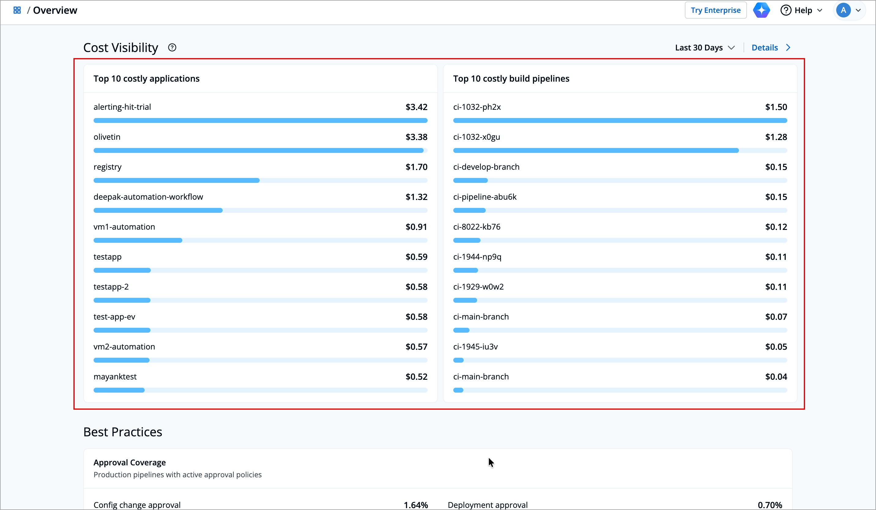
It shows:
-
Top 10 Costly Applications - It shows which deployed applications consume the most resources (such as CPU, memory, or storage) across your clusters.
-
Top 10 Costly Build Pipelines - It shows the list of build pipelines that have the highest cost during image builds.
You can use the time range filter (Last 24 Hours, Last 7 Days, Last 30 Days, or Last 90 Days) to select the preferred time range.
If a cluster does not have cost tracking enabled, its data will not appear in this section.
Enable the Cost Visibility module for those clusters to view accurate cost insights. Refer Cost Visibility Configurations to learn more.
Best Practices
The Best Practices section helps shows you the percentage of production pipelines for which you have enabled approval policies. It gives you a quick view of how many pipelines have checks in place before important configuration changes or deployments go live.
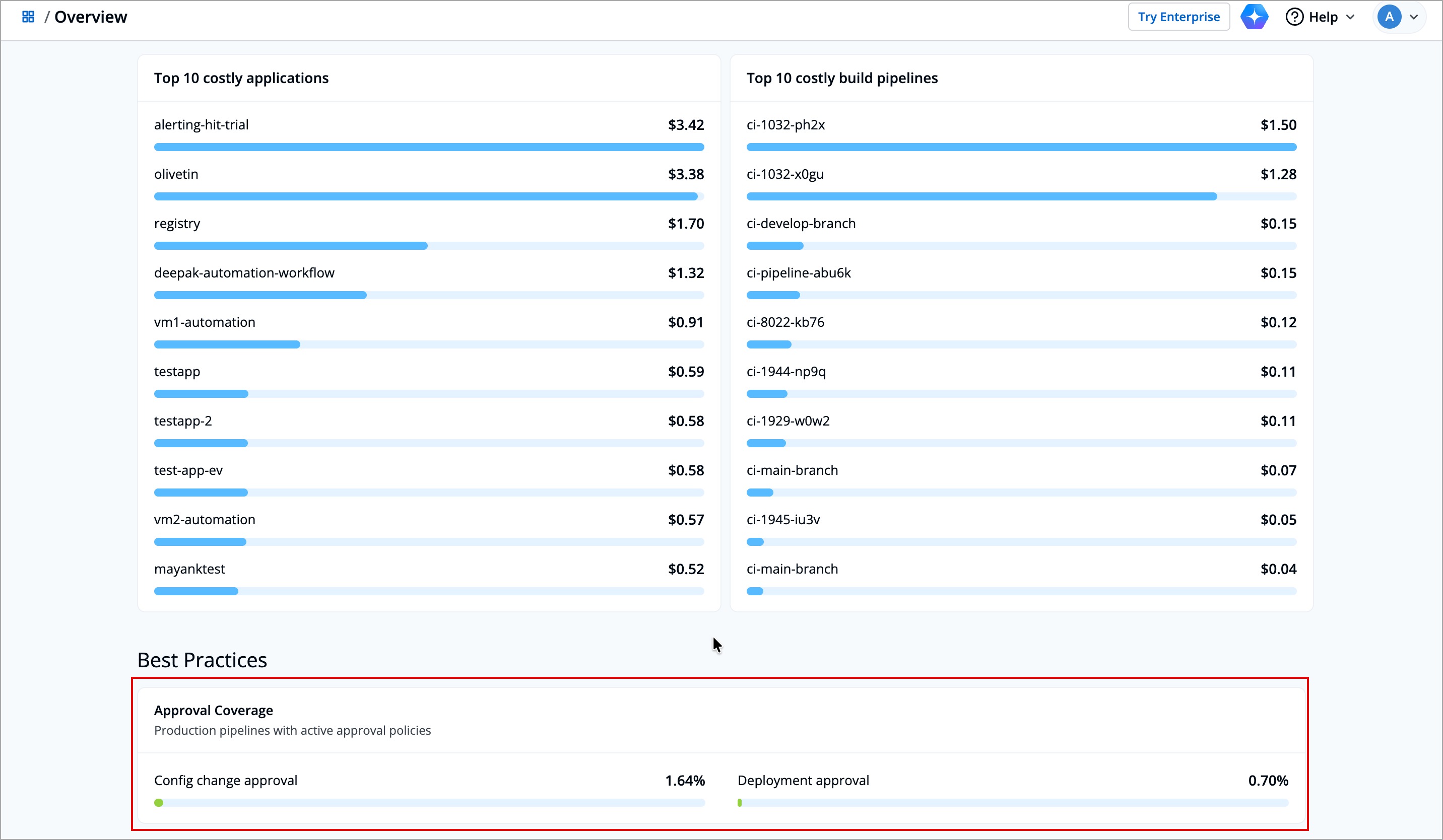
These insights help you ensure that the right governance controls are followed, reducing risks from unreviewed or accidental changes.
| Field | Description |
|---|---|
| Config Change Approval | Indicates the percentage of pipelines that require approval before applying configuration changes |
| Deployment Approval | Indicates the percentage of pipelines that require approval before executing a deployment |
FAQs
1. Why do the count of Devtron and Helm applications differs from what I see in my dashboards?
The count displayed in the application overview reflects all connected clusters which are reachable. If some applications are missing, verify that the clusters where they are deployed are reachable.
Disconnected clusters or standalone Helm releases won’t appear until Devtron syncs them.
If still you cannot see your applications, contact Devtron Support for assistant.
2. Why do my triggers or build time graphs look empty?
Graphs may appear blank if:
- No builds or deployments were triggered during the selected Time Range
- Pipelines were recently created and have no activity yet
Try expanding the time filter (for example, from This Week to Last 30 Days) or verifying pipeline execution history.
3. Why do I see cost data for some applications but not others?
Cost data appears only for applications deployed in clusters where Cost Visibility is enabled.
If a cluster doesn’t have cost visibility enabled, its data won’t appear.
You can enable it under Cost Visibility → Configurations to start tracking cost for those applications. Refer Configurations to learn more.
4. How frequently are these metrics updated?
Metrics on the Application Overview page are refreshed automatically every hour.