Overview
Make sure that Cost Visibility is enabled for your clusters.
If it is not enabled, no cost data or insights will appear on the overview page.
Refer to Cost Visibility Configurations for setup instructions.
Introduction 
The Overview page provides a summary of infrastructure costs across your Applications, Clusters, Environments, Projects, and Infra Components in Devtron. It highlights overall spend, resource-level distribution, and opportunities for optimization (Potential Savings).
At the top, you can choose your preferred currency time and time duration to set the context for your usage costs. This makes sure all costs on the Overview page are displayed in the correct currency and time range.
Cost Overview has the following sections:
How is the cost calculated?
- Devtron calculates and updates cost data every hour based on the resource usage metrics collected from Prometheus.
- Prometheus gathers real-time data for CPU, Memory, GPU, and Storage (PV) from your connected clusters.
- Devtron then processes this data every hour to display accurate and up-to-date cost insights across your infrastructure.
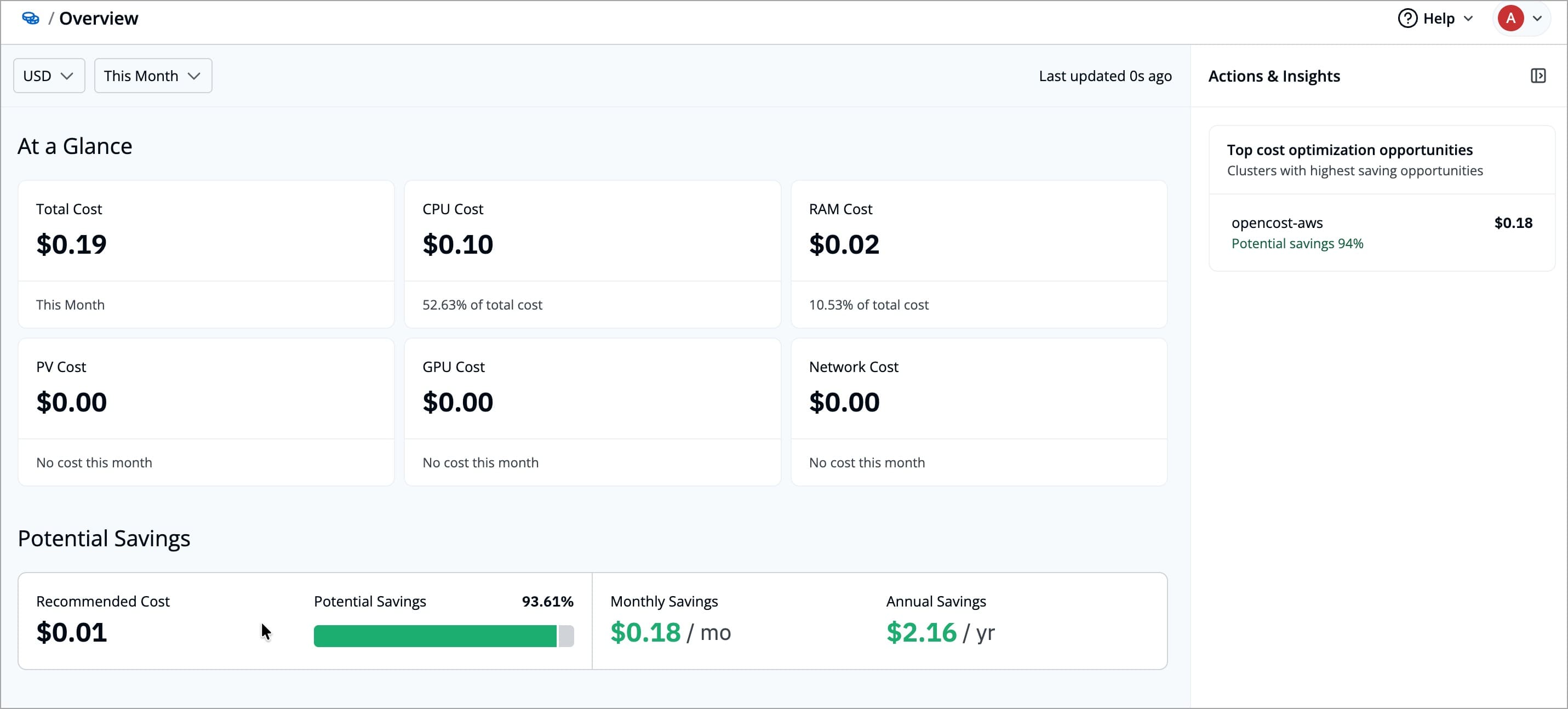
At a Glance
The At a Glance displays Total Cost, CPU Cost, RAM Cost, PV Cost, and GPU Cost cards. Each card shows the cost of its specific component, its percentage contribution to the overall spend, and a cost trend graph for the selected time period.
Potential Savings
The Potential Savings section estimates how much cost can be saved by comparing the resources you have provisioned with the resources you have actually used. It also shows the percentage of current spend that could be saved.
| Field | Description |
|---|---|
| Recommended Cost | The estimated cost calculated from actual resource usage instead of allocated capacity |
| Potential Savings | The amount which you could have saved, for the selected time period |
| Estimated cost reduction | The percentage of your current spend that could be saved, for the selected time period |
Track Performance
The Track Performance section helps you understand costs in more detail by breaking them down across different views and time ranges. It includes two charts, Cost Breakdown and Cost Trend.
Cost Trend Line Chart
The Cost Trend line chart helps you understand, how your total and individual resource usage costs change over time. It helps you analyze spending patterns and identify which resources contribute most to your overall cost.
Each colored line represents a specific infrastructure component, CPU, Memory, Storage, or GPU, while the Total line combines all costs. Hovering over any point on the graph displays the exact cost breakdown for that day.
You can change the time range (for example, Last 24 hours, Last 7 Days, Last 30 Days, or Last 90 Days) to view trends for a specific period.
You can check the color codes for each cost type directly below the chart in the Devtron UI.
Each color label (like CPU Cost, Memory Cost, or GPU Cost) helps you quickly identify which color represents which resource.
Cost Breakdown Bar Chart
The Cost Breakdown Bar Chart helps you see how costs are distributed across different infrastructure components for the selected time period.
Each bar represents one Application, Cluster, Environment, or Project, and the colored segments in the bar show the share of different infrastructure components. This makes it easy to compare categories and see which infrastructure components are contributing most to their total cost.
You can:
-
Change the time range (for example, Last 24 hours, Last 7 Days, Last 30 Days, or Last 90 Days) to view trends for a specific period.
-
Filter the cost data by Application, Cluster, Environment, or Project to see how costs are distributed across each scope.
-
Sort the cost data by cost (high to low or low to high) or name (A to Z or Z to A) to quickly find the highest spenders or locate specific items.
You can check the color codes for each cost type directly below the chart in the Devtron UI.
Each color label (like CPU Cost, Memory Cost, or GPU Cost) helps you quickly identify which color represents which resource.
Most Cost Efficient
The Most Cost Efficient section helps you identify which resources are utilizing costs most effectively across different scopes, such as Cluster, Application, Environment, or Project.
Each row in the list displays
| Field | Description |
|---|---|
| Name | The name of the selected category (for example, a project, application, cluster, or environment) |
| Total Cost | The total cost incurred by that category within the selected time range |
| Cost Efficiency (%) | Indicates how efficiently the resource utilizes its allocated cost compared to others. Higher values represent better cost efficiency |
You can use the dropdown menus to customize your view:
| Filter | Description |
|---|---|
| Scope Selector | Lets you choose whether to view cost efficiency by Cluster, Application, Environment, or Project. |
| Time Range | Allows you to select the time range, Last 24 Hours, Last 7 Days, Last 30 Days, or Last 90 Days. |
Most Expensive
The Most Expensive section highlights the clusters, applications, environments, or projects that contribute the highest costs over a selected time range. This helps you quickly identify where your infrastructure expenses are concentrated and which components may require optimization.
Each row in the list displays:
| Field | Description |
|---|---|
| Name | The name of the selected category, such as a Cluster, Application, Environment, or Project |
| Cost Type | The selected cost type, such as CPU, Memory, Storage, GPU, or Total Cost |
| Total Cost | The total cost incurred by that category for the chosen cost type within the specified time period |
You can customize the view using the following filters:
| Filter | Description |
|---|---|
| Scope Selector | Lets you choose for which category (Cluster, Application, Environment, or Project), you want to view the most expensive resources |
| Time Range | Allows you to choose the time period for cost evaluation, Last 24 Hours, Last 7 Days, Last 30 Days, or Last 90 Days. |
| Cost Type | Enables you to filter costs by specific categories such as CPU Cost, Memory Cost, Storage Cost, GPU Cost, or Total Cost. |
Actions and Insights
The Actions & Insights section highlights where you can achieve the highest cost savings. It shows the categories with the largest cost saving opportunities, based on the difference between allocated resources and your actual usage.
It also shows the cost visibility status, which displays the number of clusters where cost visibility is enabled, failed, in progress, or not enabled. This helps you understand for which clusters cost data is currently being tracked and if you want you can enable/disable cost tracking for the cluster by clicking on Go to configurations button. Refer configurations to learn more.
Each category in the Top saving opportunities will show
| Field | Description |
|---|---|
| Name | The name of the category (for example, a cluster, application, or environment) with the largest savings opportunities |
| Potential Savings (%) | The percentage of your current spend that could be saved, for the selected time range |
| Estimated Savings | The estimated cost you could save in that category, based on the difference between provisioned and used resources, for the selected time range |
Clicking on any item in this list takes you to its detailed Cost Breakdown page. Refer Cost Breakdown to learn more.
FAQs
1. Why am I not seeing cost data on the Overview page?
Cost Visibility is only supported for Devtron and Helm applications.
If you’re only using Argo CD or Flux apps, their cost data won’t appear.
Also, ensure that Cost Visibility is enabled for your cluster, refer Configurations to learn more.
2. What should I do if the graphs look empty or incomplete?
This usually happens when cost tracking is not enabled for certain clusters or when there’s no activity in the selected time range.
Try expanding the time range.
3. Can I compare costs across different clusters or applications?
Yes. The Cost Breakdown, let you compare spend across Clusters, Applications, Environments, or Projects.
You can also use filters and sorting options to focus on a specific scope or resource type.
4. What does Potential Savings mean in simple terms?
It shows how much you could save if your resources were right-sized, i.e, it’s the difference between what you’ve allocated and what you actually use.
5. How often is the cost data updated?
Cost data is refreshed automatically every hour, based on the latest metrics from Prometheus.