Cost Breakdown
Introduction 
While the Overview section gives you a quick summary of overall spending, the Cost Breakdown page lets you analyze deeper into where those costs come from. It helps you analyze costs within a selected category (Clusters, Applications, Environments, or Projects), for a specific time range.
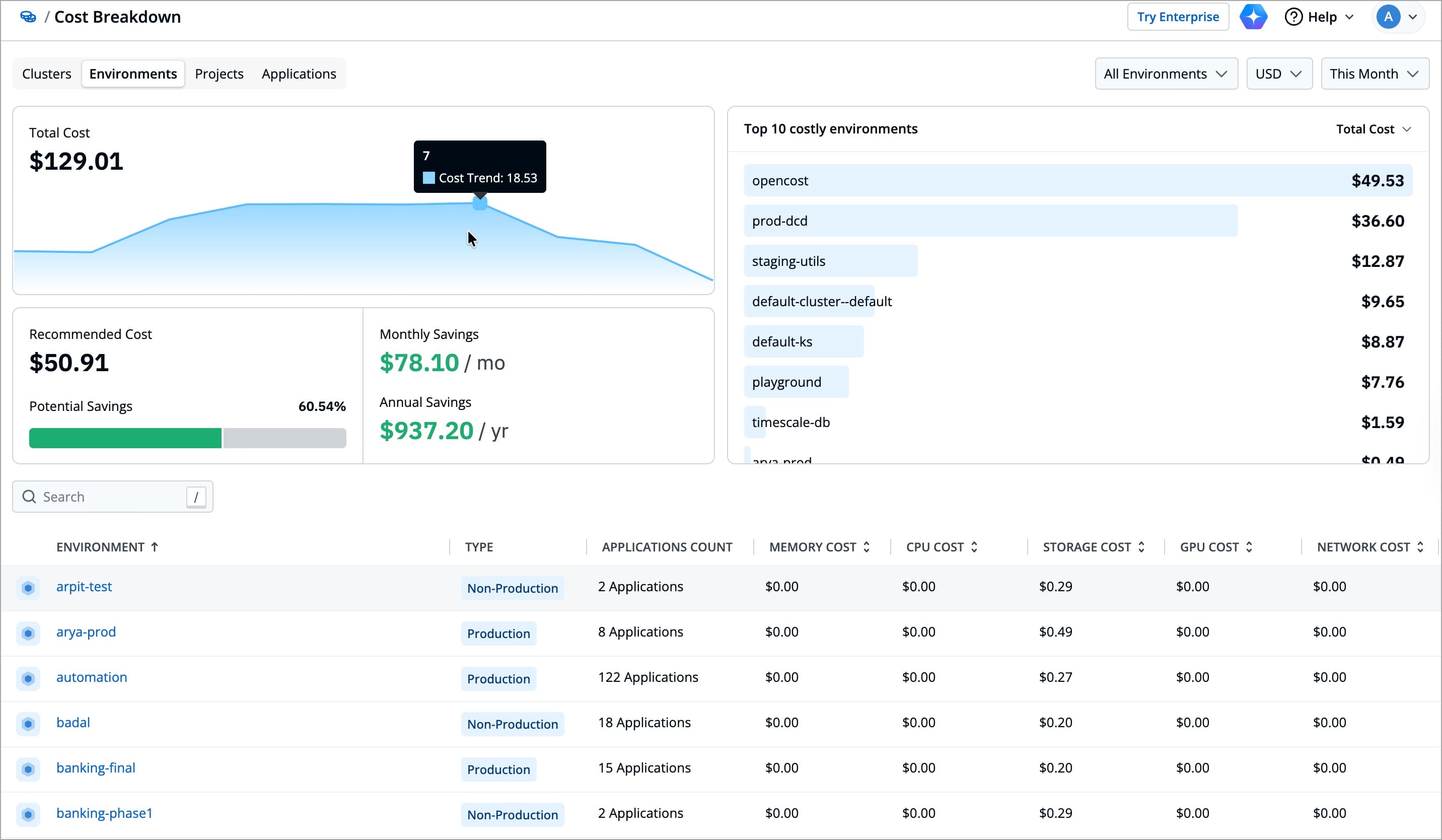
You can apply filters in the top-right corner to adjust the view. Selecting the right filters helps you to focus on the most relevant cost information for your preferred analysis.
For example, you might want to analyze your most recent infrastructure spend across production clusters. In that case, you can set the Clusters Scope filter to Production and select a Time Range of Last 30 Days. This will give you a focused view of active workloads and recent spending trends, without including cost from other clusters.
Imagine your team is reviewing this month’s cloud spends and wants to focus only on production clusters. You open the Cost Breakdown page, set the Clusters Scope to Production, choose your preferred Currency, and adjust the Time Range to Last 30 Days. Instantly, the data updates to show just the relevant costs, providing you a clear picture of active environments and helps you spot any unusual spending patterns. With these quick filters, your team can focus on costs within the defined scope, ensuring the analysis stays relevant to your current objective.
| Filter | Description |
|---|---|
| Cluster Scope | Choose whether to view costs across all clusters or environments, or limit the view to only production or non-production clusters or environments |
| Currency | Displays all cost values in the currency of your choice. |
| Time Range | Defines the time range for data displayed |
Inspecting Different Categories
For the chosen category type (Clusters, Applications, Environments, or Projects), it shows the following:
For example, if you select the Clusters category, you can view the total cost across all clusters, the recommended cost based on actual usage, and the potential savings if resources were optimized. This gives you a quick, high-level view of how efficiently each cluster is utilizing its allocated resources.
Imagine your team is analyzing monthly infrastructure expenses for multiple clusters. You notice that the Total Cost for one cluster is significantly higher than the others. When you check the Recommended Cost, it’s much lower, showing that this cluster is over-provisioned. The Potential Savings metric confirms this, showing how much of your current spend could be reduced by aligning resource allocation with actual usage. With this insight, your team adjusts resource requests to improve overall cost efficiency without impacting performance. By the next billing cycle, costs come down, while the performance remains stable.
| Field | Description |
|---|---|
| Total Cost | The actual spend for the selected category type (e.g., all clusters). |
| Recommended Cost | The estimated cost calculated from actual resource usage instead of allocated capacity |
| Potential Savings | The amount which you could have saved, for the selected time period |
| Estimated cost reduction | The percentage of your current spend that could be saved, for the selected time period |
| Top 10 Costly Resources | A ranked list of 10 highest cost resources of the selected category |
You will also find a complete list of all the resources for the selected category at the bottom, helping you identify where most of your spending is concentrated.
For example, if you’re viewing the Cluster category, the list displays each cluster along with its CPU, Memory, Storage, and GPU costs. You can quickly compare clusters and identify which ones have higher spend or greater potential savings.
Suppose you’re reviewing costs within the Clusters category. As you go through the list, you notice one cluster’s Total Cost is higher than others. You look across its row and notice that both Memory Cost and Storage (PV) Cost are also on the higher side. The Potential Savings column then shows a clear opportunity to optimize usage within that cluster. With this focused view, you get a clear understanding of where your resources are being used most and which clusters might need attention, all from a single, organized view. You can then check the detailed view for those clusters to investigate further.
Each row in the list shows the following for the specific resource of the selected category:
| Field | Available For Categories | Description |
|---|---|---|
| Provider | Clusters | Shows the cloud provider or infrastructure source for each cluster |
| Type | Clusters, Environments | Shows whether each cluster or environment is Production or Non-Production |
| Applications Count | Environments, Projects | Shows the number of applications linked to each environment or project |
| Environments | Applications | Shows the number of environments where each application is deployed |
| Memory Cost | All categories | Shows the cost of memory usage for each resource in the selected category |
| CPU Cost | All categories | Shows the cost of CPU usage for each resource in the selected category |
| Storage (PV) Cost | All categories | Shows the cost of persistent volume (storage) usage for each resource in the selected category |
| GPU Cost | All categories | Shows the cost of GPU usage for each resource in the selected category |
| Total Cost | All categories | Shows the total cost of each resource |
| Potential Savings | All categories | Shows the cost and percentage of your current spend that could be saved for each resource |
Inspecting Specific Resource
Clicking on any resource in the Cost Breakdown list opens its detailed cost breakdown view. Based on the category you will see the following:
For example, after identifying a high cost Cluster in the previous section, you can click on that cluster to open its detailed breakdown. In the detailed breakdown view of the cluster, you can see which Namespaces and Applications contribute most to its total cost, and how resource types (like CPU, Memory, and Storage) are distributed.
Continuing from the earlier scenario, you open the detailed cost breakdown for the cluster that showed unusually high costs. In the Top 10 Costly Namespaces section, one namespace clearly dominates the cost chart. You then look at the Cost Breakdown by Resource Kind graph, where it becomes evident that most of this cost comes from CPU usage.
Investigating further, you discover that a few workloads in that namespace are utilizing higher memory than their actual usage. This explains the cost spike you noticed earlier. With this insight, your team can adjust resource requests and limits for those workloads to optimize cluster performance and reduce unnecessary costs.
| Field | Description |
|---|---|
| Total Cost | Shows the overall cost for the selected resource, along with a cost trend graph for the chosen time range |
| CPU | Shows the total spend on CPU resources, along with the potential savings |
| Memory | Shows the total cost for memory resources, along with the potential savings |
| Storage | Shows the total cost for persistent volume (storage), along with potential savings |
| GPU | Shows the total cost for GPU resources, along with potential savings |
Top 10 costly :
| A ranked list of 10 highest cost namespaces, or applications, or deployments within a specific cluster |
Cost Breakdown by:
| Shows the distribution of costs across Namespaces, or Applications, or Resource Kinds, or Deployments within the selected cluster.
|
Custom Views
Custom Views allows you to define your own filtered view of cluster costs. Instead of looking at costs for the entire cluster, you can create a focused view based on propagated tags (for example, filter by team, environment, or application tag).
This feature is available only under the Clusters category.
For example, if your production workloads are labeled with environment=production, you can create a custom view to track cost of production workloads only.
By creating a custom view with:
Key: environment
Operator : :
Value : production
This helps you quickly analyze how much your production workloads are costing without manually filtering every time. As long as your workloads have the right labels, Devtron automatically groups and updates the data in your custom view, giving you a consistent and focused view of your use case.
Imagine your organization runs workloads for multiple teams, frontend, backend, and logistics, all within the same cluster. Each team’s workloads have propagated tags (labels) (for example, workloads of logistic team have team=logistics propagated tag).
Your team often needs to check the monthly cloud spend for the logistics workloads, instead of applying filters for workloads every time, you create a custom view once using that label.
Now, whenever you open Cost Visibility, you simply select the “Logistics Team View” from the sidebar to instantly see total cost, usage patterns, and potential savings specific to that team because the workloads are already labeled, the data stays accurate, and your analysis remains consistent, saving time and effort each time you review costs.
Custom Views are dependent on propagated tags (labels). If tags are not mentioned and propagated in the workloads, some resources may not appear in the view. Ensure that you have added and propagated tags for the workloads you want to include in the custom view.
Creating a Custom View
To create a custom view:
-
Go to Cost Visibility → Cost Breakdown → Cluster.
-
In the sidebar, click
+icon next to Custom Views. -
Enter a Name and an optional Description for your view.
-
Enter one or more label-based filters using Key, Operator, and Value.
-
Click Apply Changes.
Once applied, a Custom View works just like any other category breakdown in Cost Visibility.
Filters
| Field | Description |
|---|---|
| Key | The label key applied to your Kubernetes resources (for example, app, team). |
| Operator | Defines the comparison logic between the key and value. |
| Value | The label value to match against (for example, logistics, prod). |
Operators
| Operator | Meaning | Example |
|---|---|---|
: | Equals to | app : frontend → selects resources where app=frontend. |
!: | Not Equals To | team !: dev → excludes resources with team=dev. |
~: | Contains | name ~: api → selects resources where label contains api. |
!~ | Not Contains | app !~: test → excludes resources where label contains test. |
<~ | Contains Prefix | env <~: prod → selects resources where label starts with prod. |
!<~ | Not Contains Prefix | env !<~: staging → excludes resources where label starts with staging. |
FAQs
1. Why does Cost Visibility show data for some clusters but not others?
Cost data appears only for clusters where Cost Visibility is enabled.
If a cluster doesn’t show cost insights, verify that the Cost Visibility module is active for that cluster.
Refer Configurations to learn more.
2. What does Connection Failed mean in Cluster Health Status?
Connection Failed means Devtron could not reach the cluster’s API server or retrieve data from it.
This can happen due to:
- Network or firewall restrictions
- Expired or invalid Kubernetes credentials
- Misconfigured cluster agent
Try revalidating credentials or redeploying the Devtron agent to restore connectivity.
3. Why does a cluster show Not Detected under Autoscaler in Node Counts?
This means Devtron couldn’t identify any predefined autoscaling configuration, it can be a custom autoscaler.
4. How often is the infrastructure data updated?
Infrastructure data (including metrics, cost, and health status) is refreshed automatically every hour.